Relevance over volume
Role, location, salary and company context help people judge an opportunity before opening it.
Product design · Job discovery
My UX/UI work on job discovery: translating research into screen structures, exploring interface variants, and shaping the journey from first interests to a personal feed.
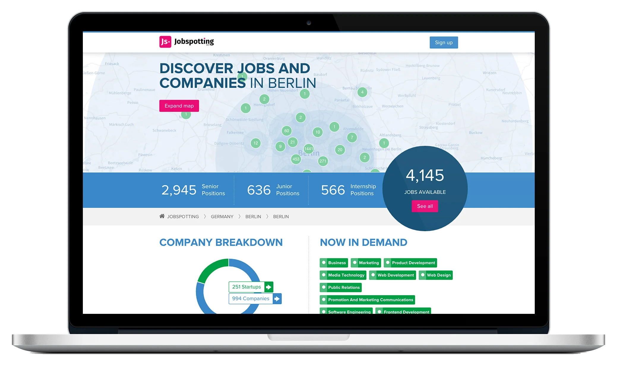
Jobspotting was a personalised job-discovery platform. My design work connected its feed, search and profile tools: deciding what people needed to see, where they could act, and how those actions would relate across screens.
Jobspotting video advertisement.
SmartRecruiters acquired Jobspotting in January 2017. This case study brings together surviving design artefacts and research in a reconstructed narrative; it does not present that narrative as a verified delivery timeline.
Research
I used the research findings to frame the interface problems before exploring solutions. I focused on what people could understand at a glance, whether they noticed feedback controls, and how they distinguished search from Explore.
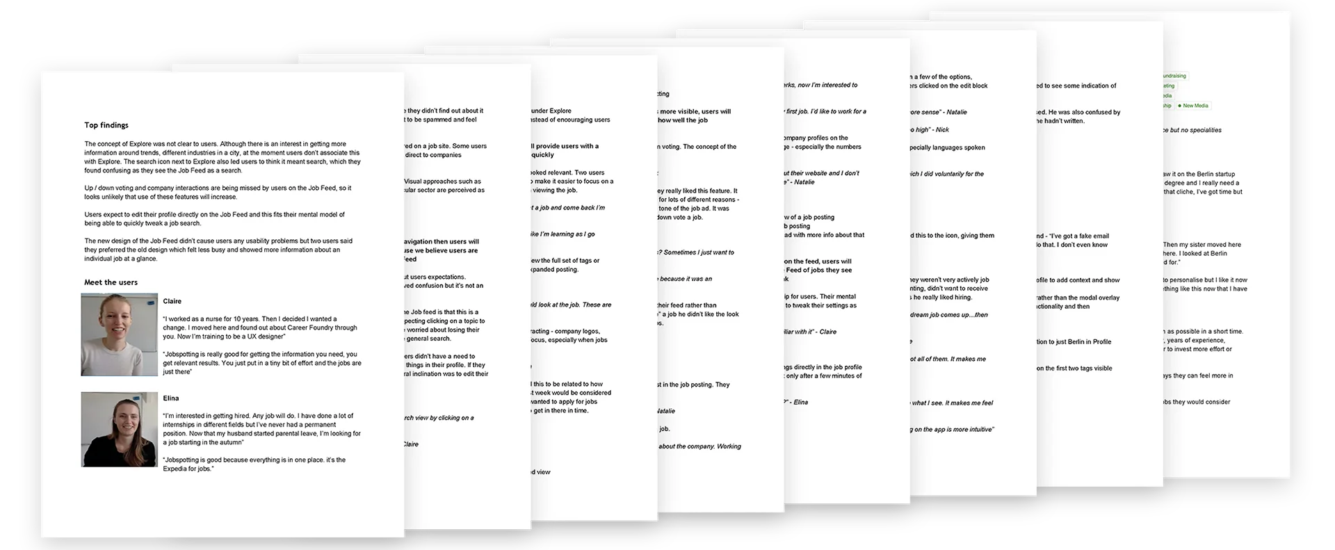
Role, location, salary and company context help people judge an opportunity before opening it.
Feedback and profile editing need to stay close to the recommendations they influence.
Explore needs a clear purpose alongside search and the personalised feed.
Framing the UX problem
I turned the research into three design prompts: separate intent, expose control and surface enough context to choose with confidence.
Structure & wireframes
I explored the structure before committing to visual detail. These two views examine how people move between discovering possibilities and editing the preferences behind their feed.
Topics, locations and companies form an exploratory layer above specific vacancies, making this page distinct from direct search.
The panel keeps role, topic and location controls close to the recommendations they affect, while preserving the feed as context.
Detailed low-fidelity vector reconstructions based on surviving project artefacts.
UX design process
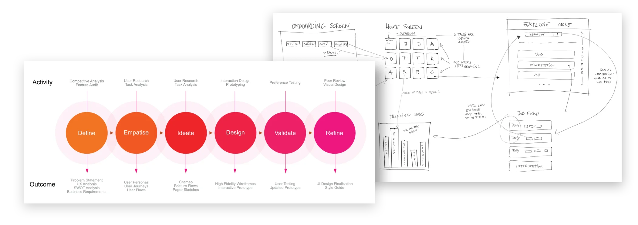
I mapped the relationship between onboarding, the feed and Explore, then used wireframes to examine where profile editing and discovery should meet. Moving between the overall flow and individual screens kept the work focused on the journey, rather than isolated layouts.
Interface design
I researched and explored different interface variants rather than treating the first layout as the answer. Across search, job cards and navigation, I compared hierarchy, placement and interaction states to work through the same UX questions at a finer level of detail.
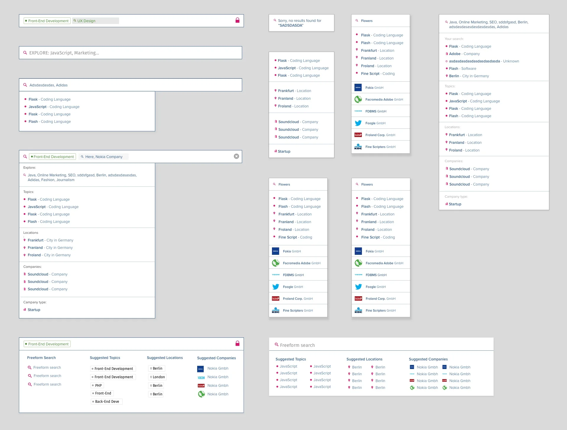
I explored variants for free-text input, grouped suggestions and selected topics. The board shows how I worked through different ways to distinguish job titles, places and companies without overloading the search field.
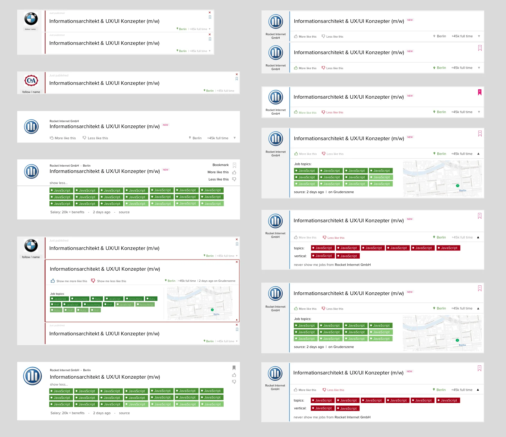
I compared compact and expanded job cards, varying the balance between role information, location, tags and feedback. The design question was what to expose in the feed and what could wait until someone opened a job.
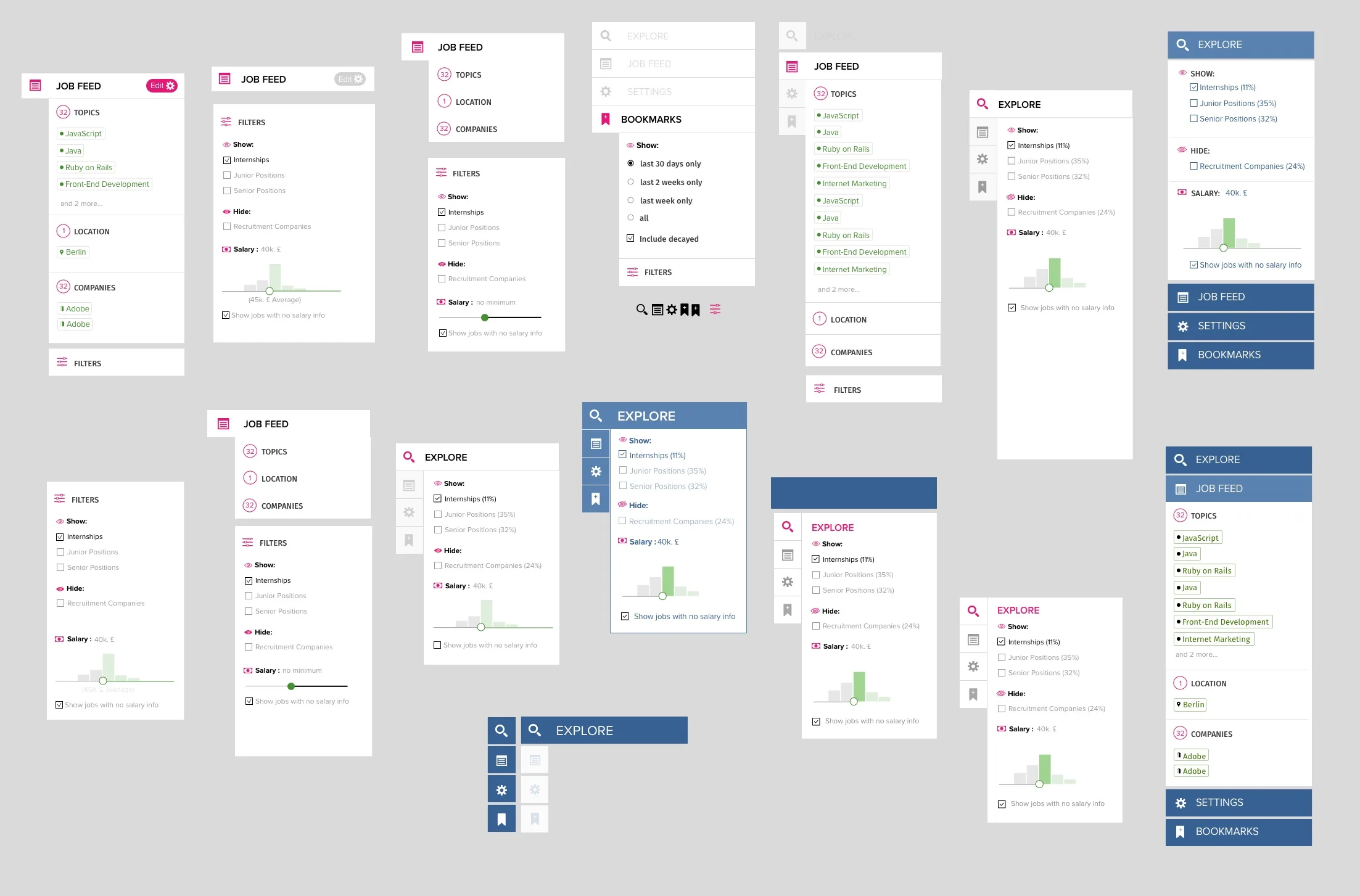
I explored how Feed, Explore, filters and saved jobs could sit together in the navigation. These variants helped me examine grouping, labels and access to profile settings as parts of one interaction system.
Marketing & launch materials
My communication design extended into the website and printed materials. Here the task shifted to information hierarchy: introducing the product, showing the interface in context, and organising a longer story into readable sections.
Final product walkthrough — original interface recording, without sound.
Final interface work
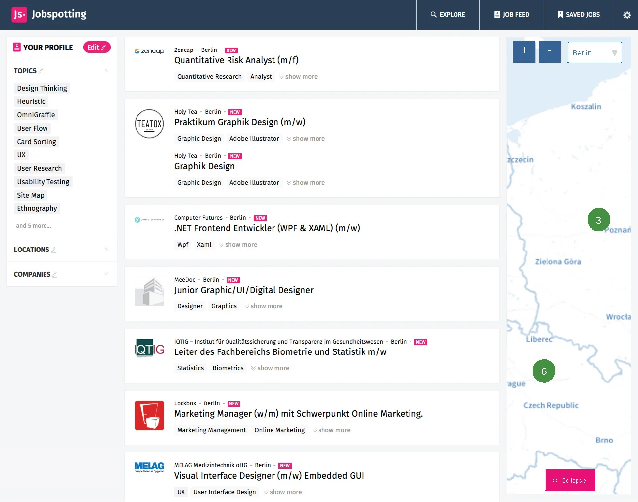
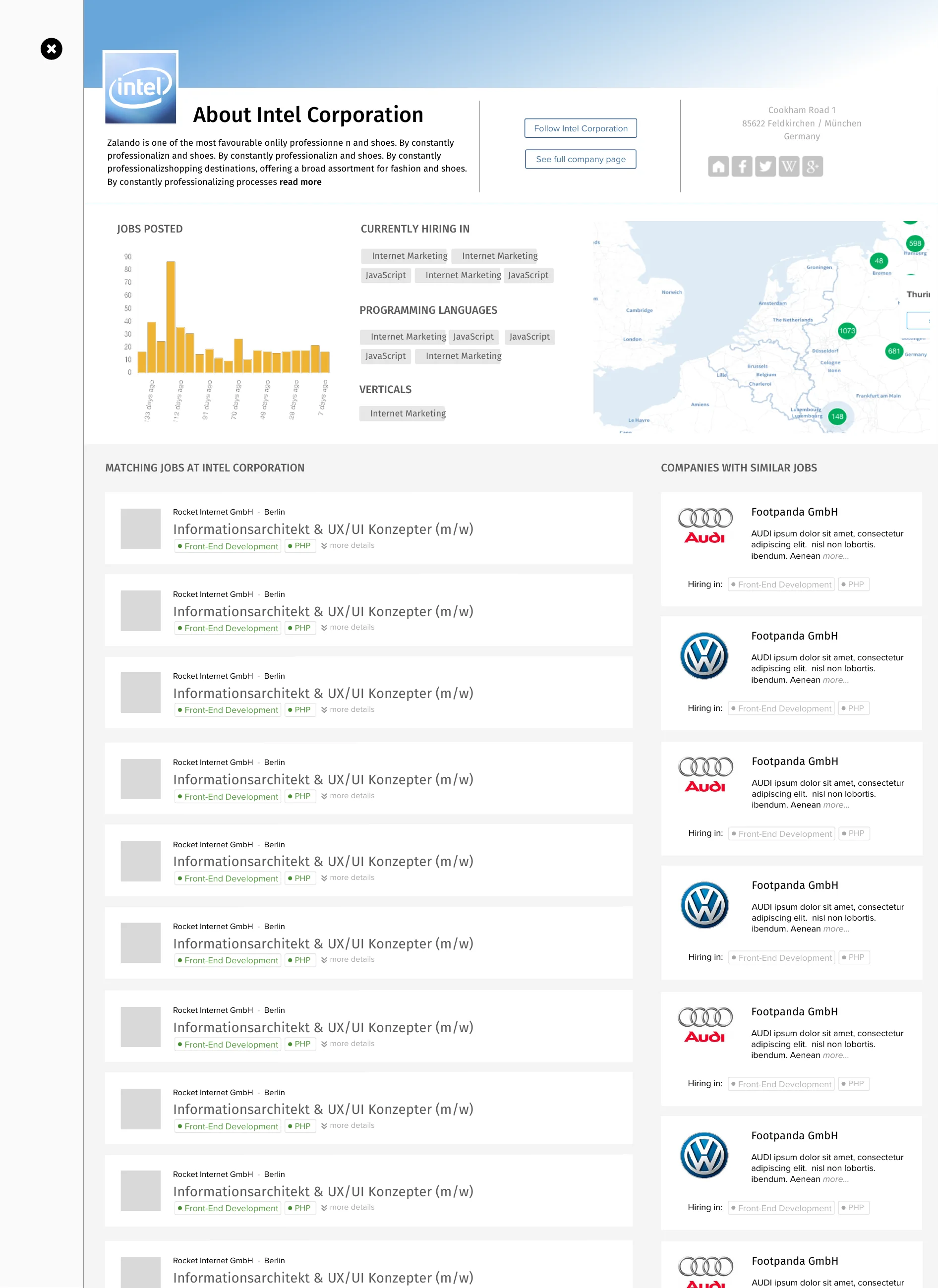
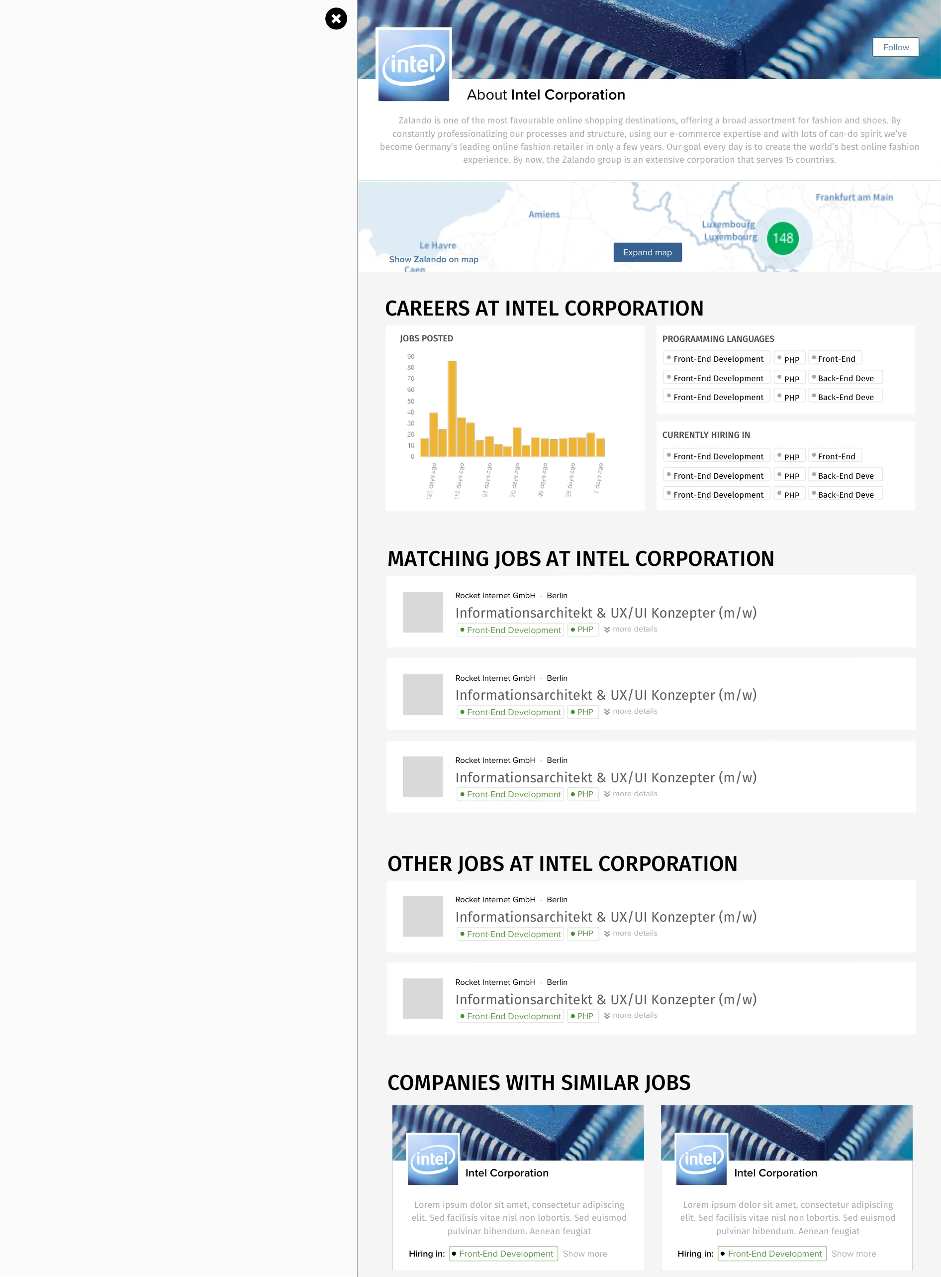
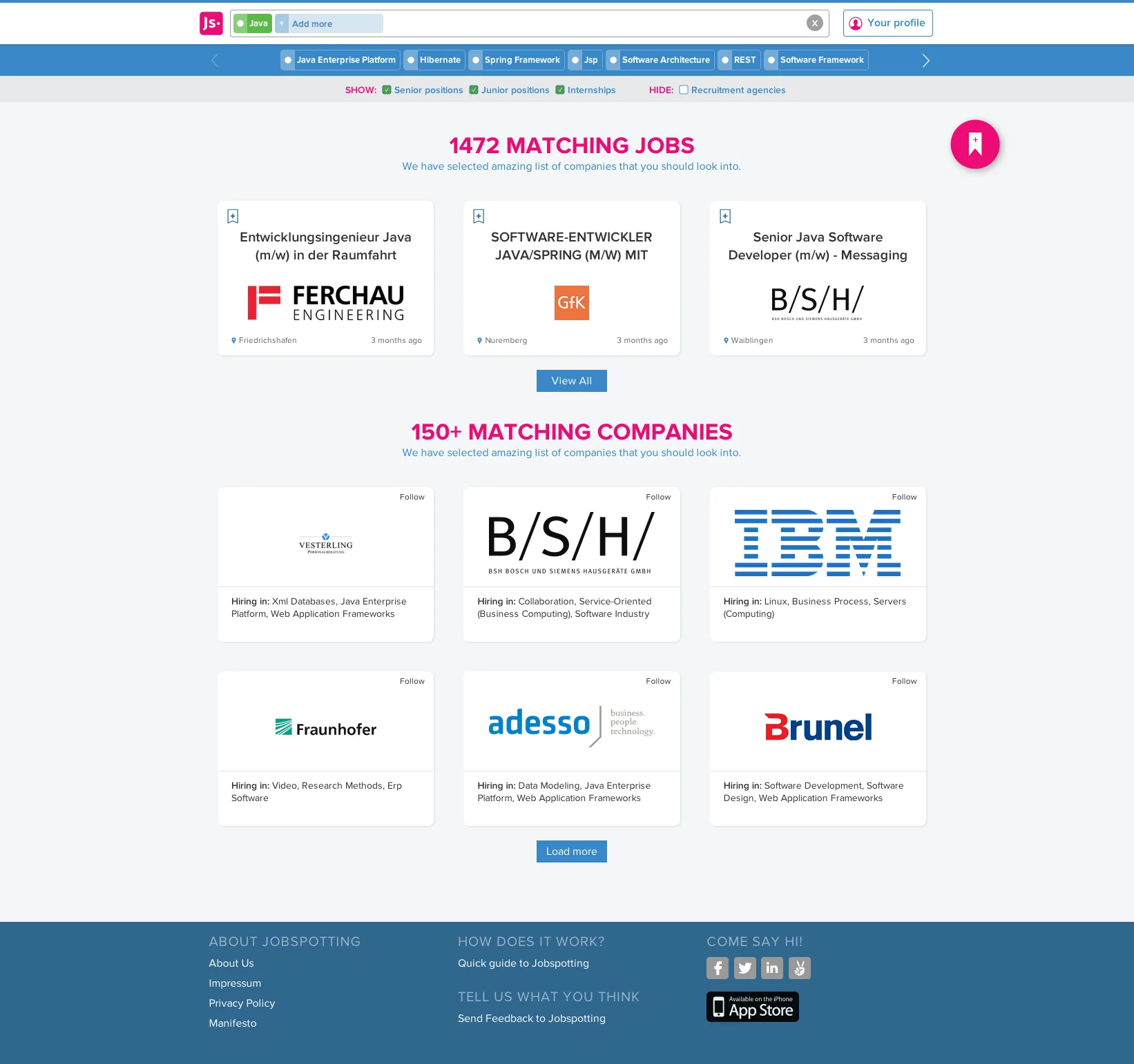
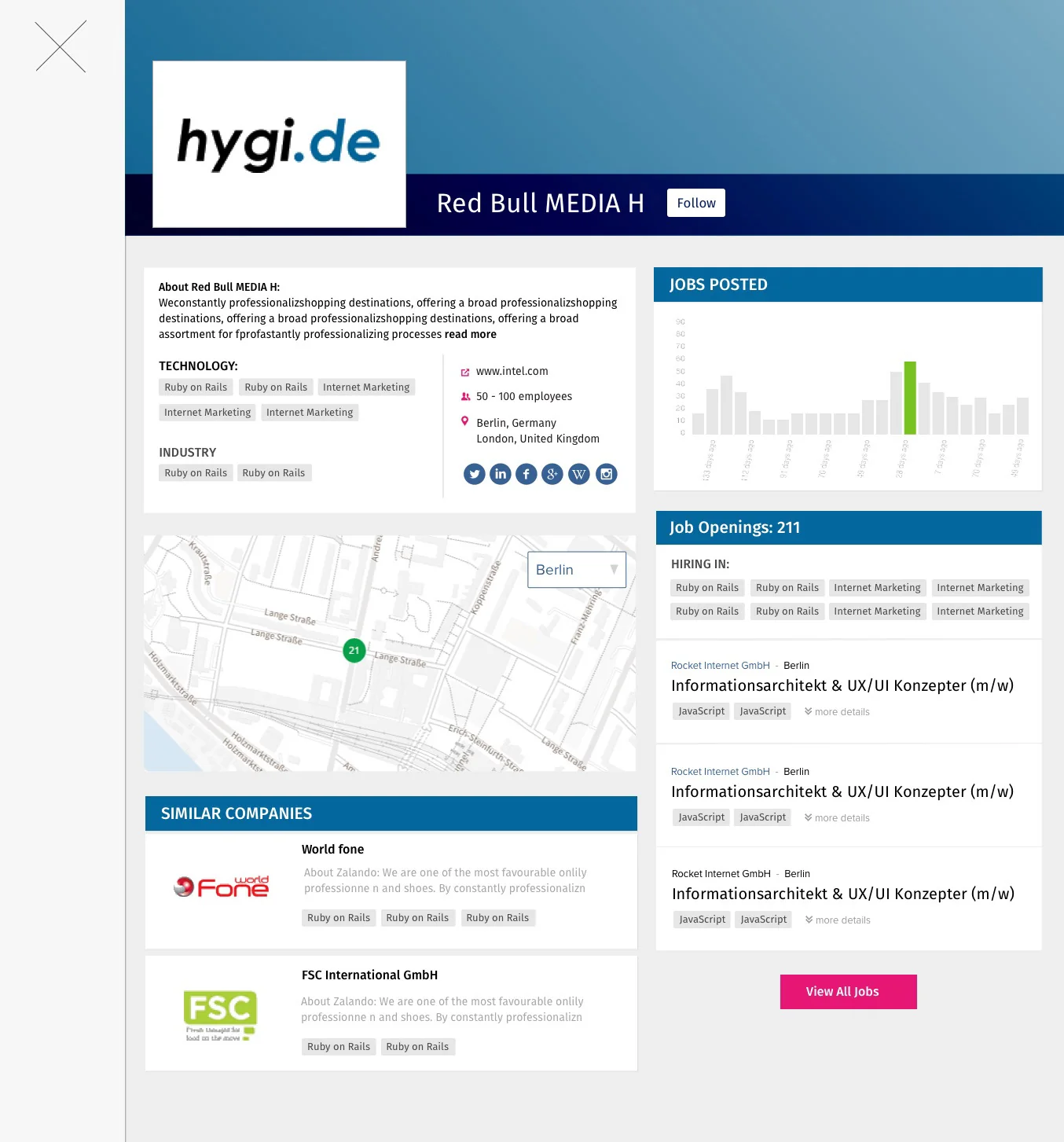
The finished screens bring together the main design language: profile signals, vacancy cards, company context, onboarding, search and navigation. These are the views I would use to inspect the interface as a complete system.
Reflection
Looking across this work, the thread in my process is the move from a broad UX question to specific interface choices. Research framed the problems; wireframes and visual variants made alternative answers concrete. The surviving material documents my design reasoning; measured user outcomes are not available.
Back to workLet’s work together
Tell me about the product and the part that needs fixing. A few sentences is enough.
Tell me about it