One system for everything
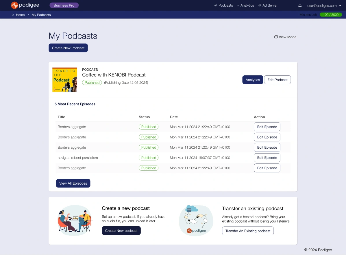
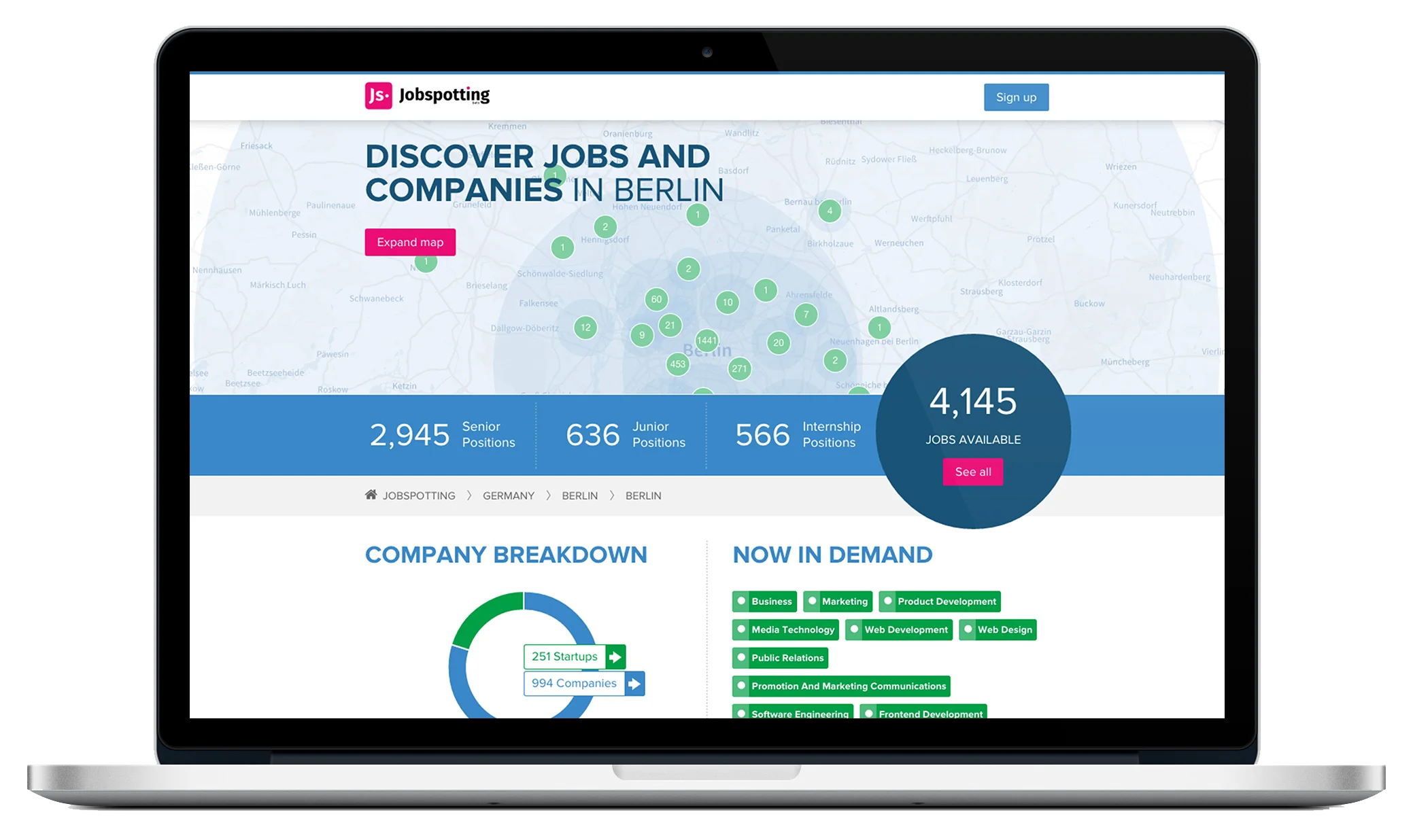
I go through what you already have, keep the pieces that work, and turn them into reusable components with clear states and guidance.
Design Systems & Branding
I connect visual identity with the components and patterns people use every day, so the product feels coherent as it grows.
I go through what you already have, keep the pieces that work, and turn them into reusable components with clear states and guidance.
Colours, type and visual style should match across your product, your website and your documents, so the company looks like one company.
How the work connects
Type, colour, spacing and hierarchy.
Shared controls with clear states.
Patterns applied in real workflows.
Related work
Practical scope
Colours, type, reusable components, and examples applied to your real screens and materials.
Let’s work together
Tell me about the product and the part that needs fixing. A few sentences is enough.
Tell me about it