Prepare before capture
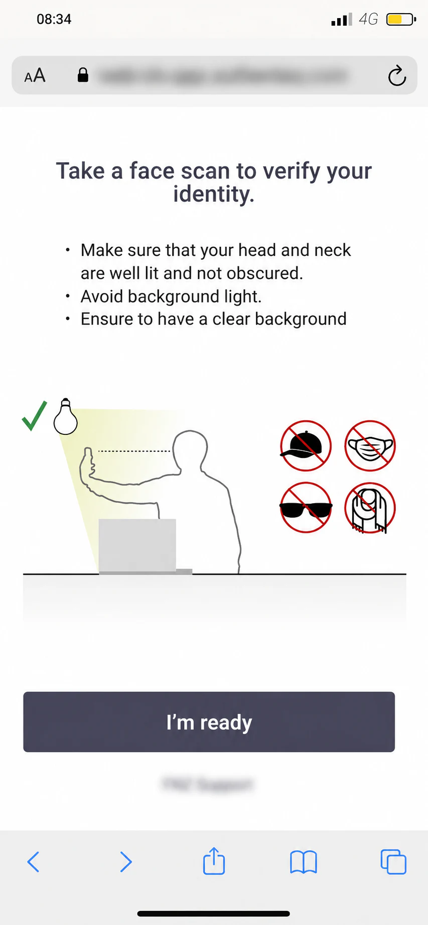
The interface explains lighting, positioning, and privacy expectations before the camera opens, then removes competing information during capture.
Past client work · enterprise UX
I designed the customer verification journey and the tools for configuring checks and reviewing evidence.
Project snapshot
My contribution was the experience design: translating verification requirements into understandable steps, defining how choices and recovery affect the journey, and carrying those decisions into interface designs and prototypes for engineering handoff. This case study focuses on that design work, rather than the underlying identity-checking technology.
Completed product design work. The interactive walkthrough is a portfolio reconstruction of the browser-based flow, not the live verification service.
Design framework
The design brief: make the next action clear without hiding the requirements or the evidence behind it.
I made capture, review and retry visible so people know what to do next.
I separated required checks from the way they are presented to the customer.
I connected each result to the document and check history that support it.
The customer had to complete unfamiliar, high-stakes tasks on a mobile device. My design response was to move guidance before each capture moment, keep the active camera state focused, and make document requirements explicit before upload.
The interface explains lighting, positioning, and privacy expectations before the camera opens, then removes competing information during capture.
I placed guidance before the scan and a quality checkpoint before submission. The review screen presents readability and glare criteria so customers can inspect their document before continuing; it does not ask them to interpret an unexplained error after submission.
I made the supported submission methods explicit. Camera capture suits a paper document; upload supports an existing file. Keeping both routes adds states to design and implement, but avoids forcing every customer through the camera regardless of what they already have.
Optional walkthrough / Browser-based verification
One process, different ways through it. Follow the original mobile screens, change the document route, and see how guidance, review and the return to desktop fit together.
Liveness
Before opening the camera, the screen explains lighting, background and what must remain visible: the head and neck.
Preparation turns an unfamiliar biometric task into a small set of understandable actions.
The source shows the control, but not its return connector. This replay illustrates a possible return to capture.
Read-only walkthrough. No camera access, file uploads or identity processing. Use the controls outside the source image to explore.


A passport requires one capture sequence. A two-sided ID introduces a second instruction and camera step, or two upload fields.
Document data review offers rescan. The photographed address document offers retry. Both make correction visible before continuing.
The desktop waits during mobile capture. The final instruction explicitly returns the person to that original context.
A separate browser-based flow, shown with original design screens and an interactive portfolio presentation. The SDK examples above demonstrate the mobile interface approach; they are not consecutive screens in this route.
The PDF documents liveness, four first-document routes, two address routes and the mobile ending. It does not expand second/third documents, a driving-licence-specific route, rejection states, retry limits or skip rules. The rescan/retry replays illustrate return wiring; the controls themselves are present in the source. Some camera mockups reuse sample card imagery across document routes. Motion, navigation, chapter labels and desktop context are portfolio presentation layers, not claims of shipped behavior.
KYC means Know Your Customer. Liveness checks whether a live person is present; proof of address supports the stated address. Completing a capture or upload is not the same as approval.
Prevention & recovery
Reconstructed from the January 2023 concept and mobile-flow overview. These trees explain design intent, not proof that every branch shipped. Select a step for its rationale.
A customer may be exploring, missing a document, or unfamiliar with the technology. Readiness determines the next step; motivation alone does not.
Scroll sideways to explore the tree, or use Fit. Select any step for an explanation.
The journey can include a liveness test, an identity document and proof of address. A readable image is an input to verification; it is not an approval.
Scroll sideways to explore the tree, or use Fit. Select any step for an explanation.
Recovery starts by explaining the issue. It then distinguishes something the customer can correct from a method limitation or an issue that needs help.
Scroll sideways to explore the tree, or use Fit. Select any step for an explanation.
Readiness, capture quality and identity approval are separate questions. Repeating an unavailable method is not a recovery strategy.
Design decisions / Operational experience
Operational users needed to configure verification journeys and later explain the outcome of an individual case. I designed a progressive information model that carries intent from policy setup through to evidence review.
Desktop / Verification policy configuration
The builder surfaces each check, its requirements, its place in the journey, and its cost. A final confirmation turns configuration into a sequence that can be reviewed before publishing.
Desktop / Compliance case review
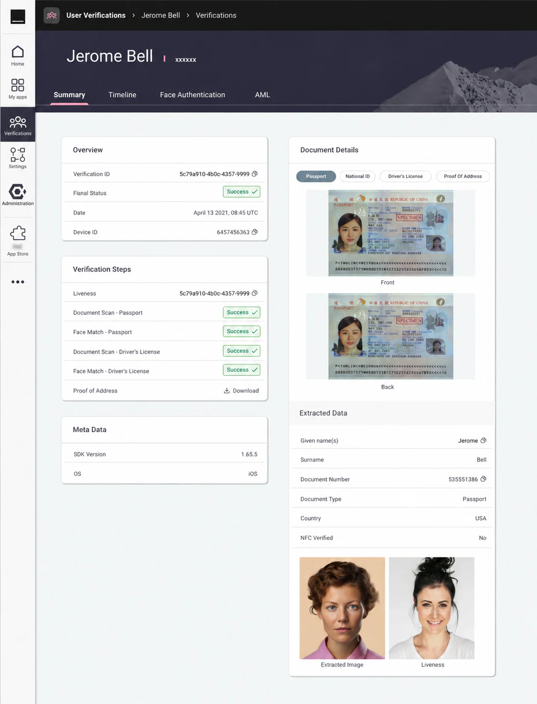
I organised the record around a practical question: what happened in this case, and what evidence supports it? The overview establishes the case context, the timeline exposes individual checks, and the document views allow closer inspection. These are complementary levels of the same review task, not separate dashboards.
What this work demonstrates
I designed the customer journey and the tools around it as parts of one service. Guidance helps a customer provide evidence; configuration defines the checks; review keeps the result connected to its source. The screens demonstrate those design decisions, without claiming a measured improvement in completion rates.
Let’s work together
Tell me about the product and the part that needs fixing. A few sentences is enough.
Tell me about it